The More-Information Mistake on Public Notices
Public notice design works better when readers can spot the main action, deadline, and location quickly, without sorting through a wall of competing text.
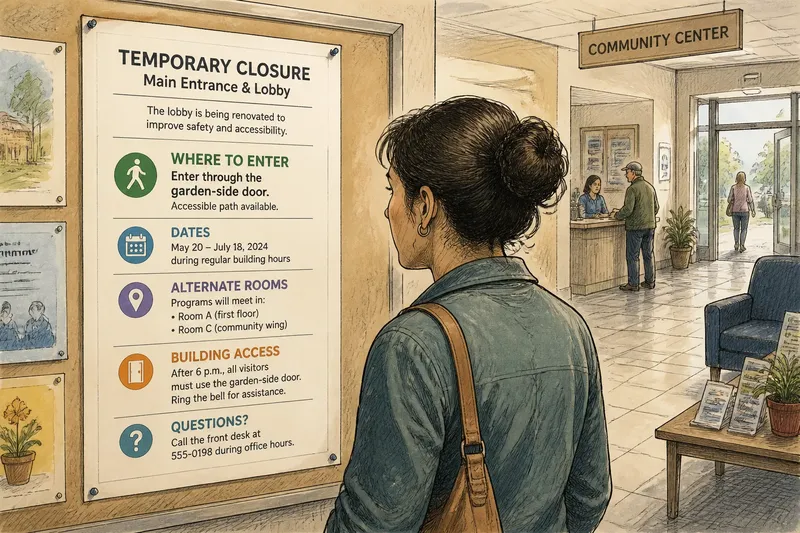
At a community center, someone stops at a notice about a room closure. It names the date, gives a reason, lists alternate rooms, explains building access, and offers a phone number. But the instruction that matters—where the evening class will meet—is buried near the bottom. Public notice design can include every useful detail and still make the message hard to find.
The problem is not simply length. A short notice can confuse readers when every line looks equally important; a longer one can be easy to scan when its details are grouped around the reader’s immediate need. Treat the page as a route through information: put the destination first, then show the supporting details along the way.
Start with the decision a reader needs to make
Before drafting, name the action or understanding the notice should produce. A reader might need to use another entrance, attend a meeting, avoid a closed path, or take no action. That central point should shape the headline and the first block of text.
Write the main message in a plain sentence. “Use the west entrance after 6 p.m.” is more immediately useful than “Temporary changes to building access.” The second phrase can still identify the subject as a heading, but it should not make readers hunt for the instruction.
Then sort details by the questions they answer:
- What is changing? If the change is clear in the draft, state it directly; if not, revise the opening before adding context.
- Who or what is affected? If readers can identify the building, service, route, or audience, keep that wording; if not, name the affected place or group.
- When does it apply? If the relevant date or time is specific, include it; if it is unclear, confirm it with the responsible person before posting.
- What should a reader do? If the action is easy to spot, keep it near the top; if not, move it into the first block and state it plainly.
- Where can someone get more help? If a contact can answer likely questions, include it; if not, choose a useful staffed destination or omit the dead end.
- What context changes the decision? If a reason helps readers understand or act, place it after the instruction; if it repeats the message, cut it.
This is not a demand to omit context. It is a way to make context earn its space. A reason for a change may reassure readers or prevent confusion, but it usually supports the instruction rather than replacing it.
Group details around the questions readers ask
People often encounter public notices while standing, walking, or waiting. They may have only a moment to locate a date or direction. One long paragraph asks them to do the grouping in their heads. Headings, short blocks, and lists make that structure visible.
Keep related information together. An event notice might have one block for the event, another for time and place, and a final block for access needs or contact details. A service-change notice could group the affected service, dates, and alternative. Separate unrelated topics rather than asking one paragraph to carry them all.
Line breaks matter, too. A compact block with a descriptive heading is easier to pick out than a paragraph broken into isolated fragments. Use bullets when readers need to compare locations or actions, and numbered steps only when the order matters. If an item needs a long explanation, consider whether it belongs on a linked page or a separate handout.
Imagine a neighborhood center needs to announce that its main entrance will close during a lobby renovation. The draft starts with background about the work and puts the alternate entrance in its last sentence. The editor moves “Enter through the garden-side door” to the first block, groups the affected dates and door location under “Where to enter,” and puts the renovation explanation afterward. A visitor scanning the sheet can then find the route before reading the background.
Use type and space to show priority
Visual hierarchy tells readers where to begin and how the parts relate. It does not require elaborate graphics. A clear headline, readable body text, consistent subheads, and open space can distinguish the main message from supporting details.
Use size, weight, and position deliberately. The headline should identify the subject, while a prominent action line carries the instruction. Supporting details can sit below in a quieter style. If every line is bold, boxed, capitalized, or brightly colored, those treatments stop signaling priority.
Alignment helps create order. Left-aligned text is generally easy to follow across lines; centered blocks can work for a short event announcement but become harder to scan as sentences grow. Avoid decorative type for important dates or directions. Keep contrast strong enough for the notice’s actual setting, including hallways with uneven light.
Whitespace is not wasted room. It separates groups and gives the headline room to register. If the draft feels cramped, remove repetition, tighten vague wording, or move secondary information to another channel. Shrinking the type to fit a crowded page may preserve every sentence while making the notice less usable.
Keep essential information on the page
Some details are essential at the point of decision; others are useful only to a smaller audience. The notice should carry what a passerby needs to understand the change and respond. A web address, QR code, or contact point can offer more detail, but should not replace an instruction people need before acting.
Check whether a link is practical in the setting. A QR code may help near a staffed desk, but less so on a sign where people cannot stop safely or may not have phone access. Include a readable web address or another route to help when the setting calls for it. If the notice directs people elsewhere, name that location on the page rather than relying on a map link alone.
Details can also age at different rates. A notice with a temporary instruction may need a clear end point or a way to identify when it is no longer current. Include a phone number or office name only if someone can respond to the questions readers are likely to ask.
Revise when the information is ready
A weekday-by-weekday schedule can make routine editing feel organized, but its timing is arbitrary unless it matches a real deadline or a reviewer’s availability. For a practical notice, use a short sequence of checks instead: each one answers a different question, and none requires waiting for a particular day. A time-sensitive safety message should follow the responsible organization’s established process rather than pause for a leisurely edit.
- Define the task. Write one sentence describing what a reader should understand or do. List the audience, location, and period the notice covers.
- Draft the essentials. Put the main message first, then add context and contact details that help readers act or understand.
- Group the information. Divide the text by reader questions. Add a descriptive heading, short blocks, and a list if people must compare options.
- Inspect the page in context. Print it or view it at the size it will be posted. Check whether the headline, action, date, and location stand apart and whether the smallest type is comfortable to read.
- Ask another reader to scan it. Have someone unfamiliar with the draft point out the action, relevant time, and location without coaching. If they miss one, revise its wording or placement; then ask the responsible person to confirm the final details.
Say a center has a draft for a class moving from the Oak Room to the Garden Room during a lobby repair, with the move applying to Tuesday evening only. The editor writes “Tuesday’s class meets in the Garden Room” first, then groups the date and room together, adds “Use the side entrance” if that route is confirmed, and moves the repair explanation below. On inspection, the editor sees that the room name is prominent but the date is hard to distinguish, so they give the date its own line. An unfamiliar reader can then identify the class location and timing at a glance; if the side entrance has not been confirmed, the editor leaves that instruction out until it is.
Which details should appear first?
Should the headline name the topic or the action?
Use a heading that makes the subject recognizable, then place the action close beneath it. “Pool entrance closed” names the issue; “Use the east gate” tells readers what to do. Together, they orient a passerby without making the headline carry every detail.
How much background belongs on a public notice?
Include background when it explains a change, resolves a likely question, or helps readers understand the instruction. Keep it after the action unless the reason itself changes what readers need to do.
Can icons and color communicate the message alone?
They can support the words, but should not carry essential meaning on their own. A symbol may be unfamiliar, and color can be hard to distinguish in some conditions, so pair visual cues with clear text.
When should a notice direct readers elsewhere?
Use a second source when the full explanation is too detailed for the page or information changes often. Keep the immediate action, relevant timing, and necessary location visible on the notice itself.
Check the page from a visitor’s position
Before posting, read the notice from the distance and position a visitor is likely to encounter it. Check that the main instruction is not hidden by a logo, dense block, or decorative border. Confirm that the route to further help is legible and that the page does not imply more urgency than the message warrants.
Good public notice design is not a contest to fit the most text onto a sheet. It is the careful arrangement of essential details and the context that makes them understandable. When a first glance reveals the subject and the next reveals what to do, the page has made its information easier to use. Keep the main search phrase in mind as a practical test: can someone scanning the notice find the public notice design’s central instruction without having to read every line?